Microsoft PAX wanted to build a Graphing feature for students grades 6-8 so they could better understand the fundamentals of Algebra and Trigonometry. The graphing feature had to enable students to experiment with vectors via sliding values, and allow them to render multiple equations at once. The graphing engine had to be able to support the Common Core Math requirements of Grade 8 and beyond.
Our goals were to:
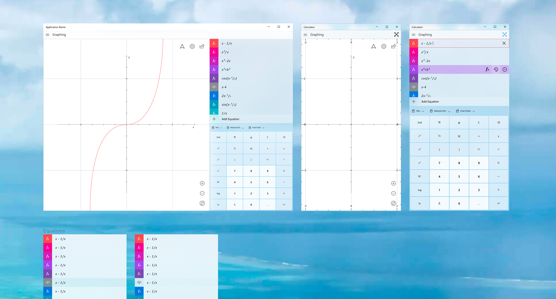
1. Introduce Graphing to the Windows Calculator
2. Support Common Core 6-8 Curriculum
3. Research, Test, Spec in 9 Months
2. Support Common Core 6-8 Curriculum
3. Research, Test, Spec in 9 Months
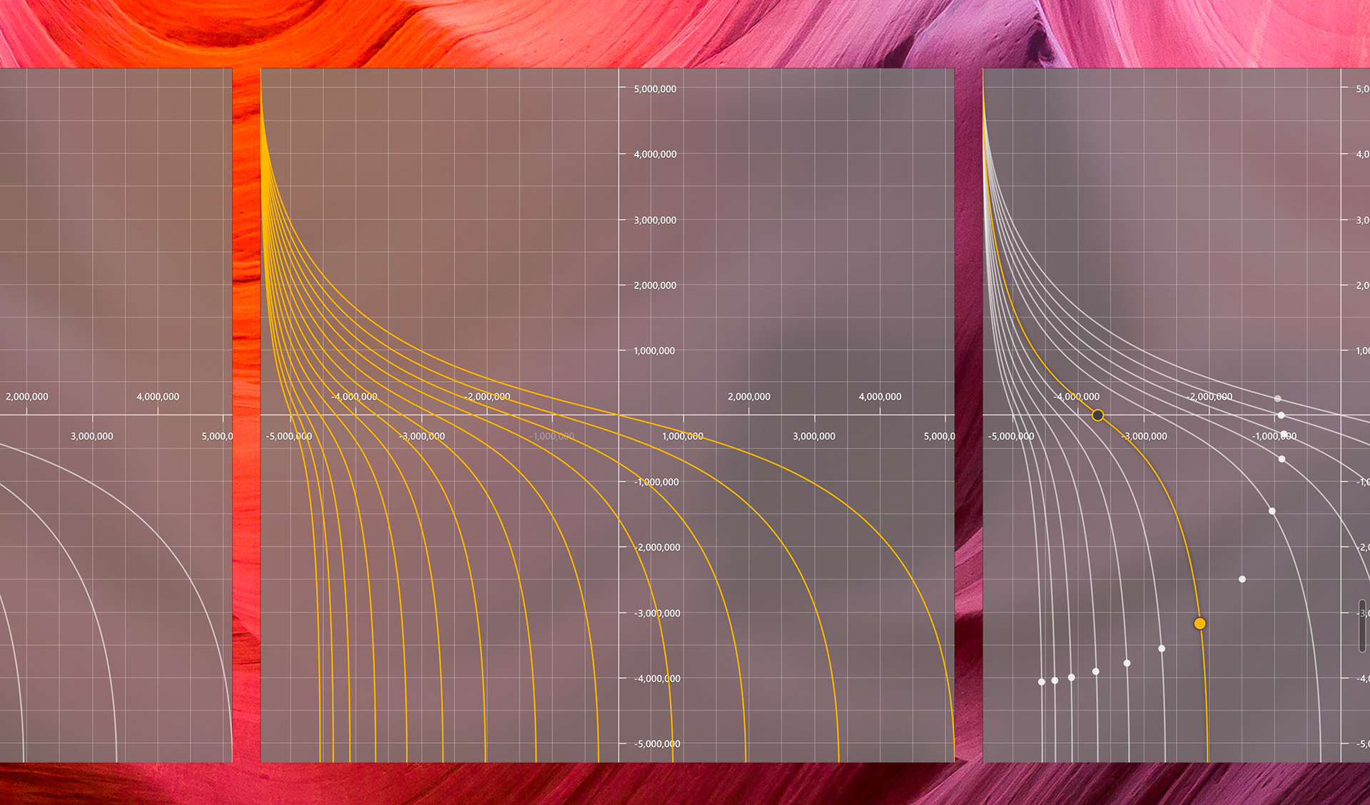
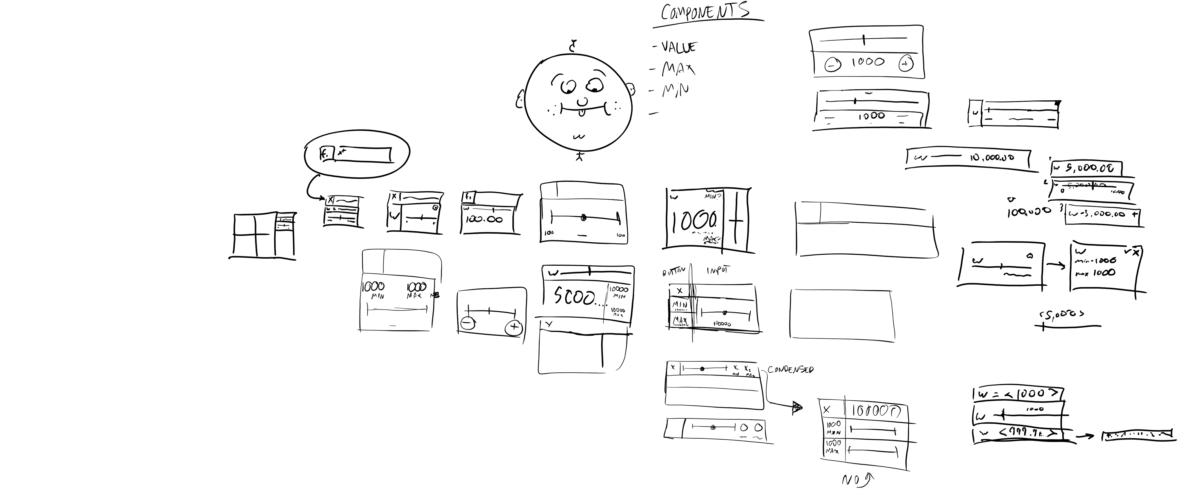
An early visual exploration.
Planning
We had to define an MVP experience to work towards. So we started with a list of "User Cans." These are statements that define a feature of the working product without describing specific UI elements. The example listed below is a later version of this document. It includes rank, release necessity (crawl, walk, run), and associated UI/code. These are not needed to start a User Can document, but should be integrated as planning becomes more precise.
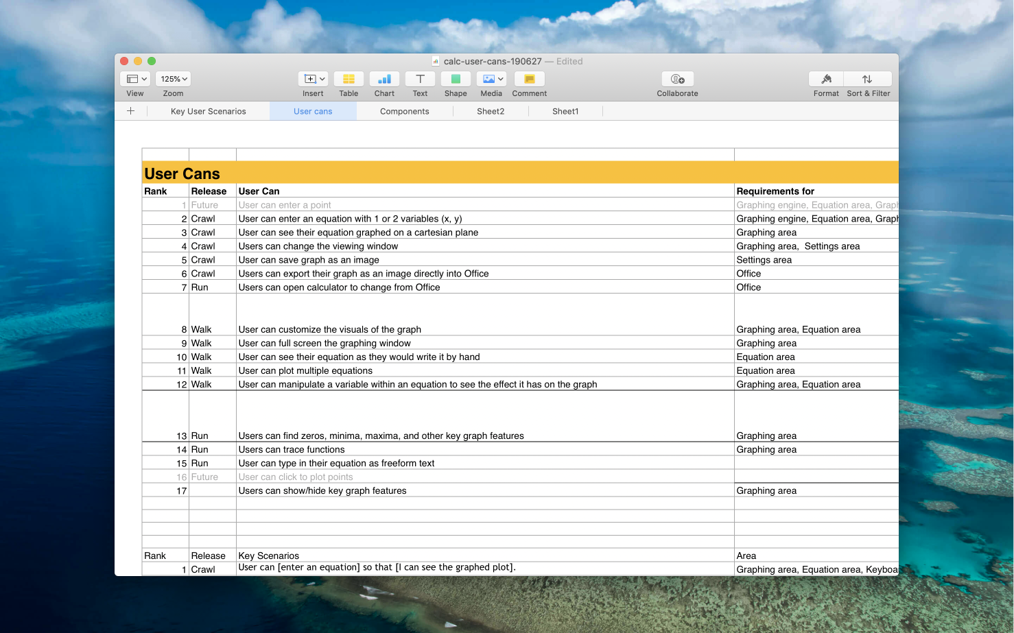
The "Rank" and "Release" of a User Can determine how important it is that it be implemented in a certain amount of time. "Release" is a reflection of necessity and effort. User Cans that are ranked as "Crawl" are integral to the final product. Features ranked as "Run" are not necessary and often require more development resources to implement. After defining the most critical User Cans, the Key Scenarios can be flushed out.
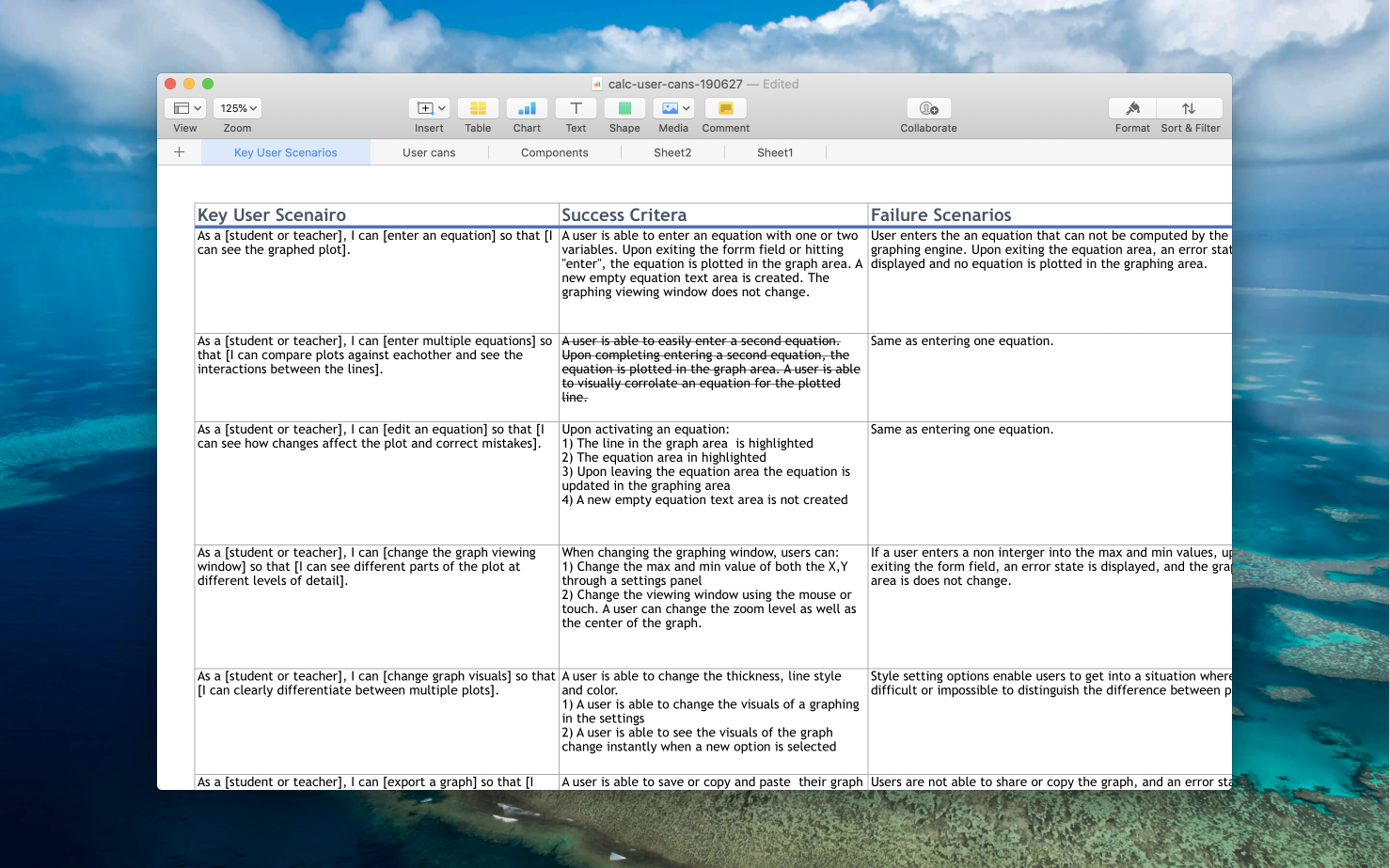
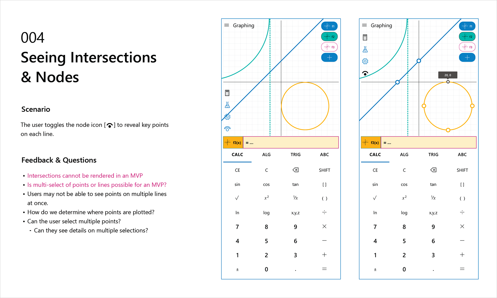
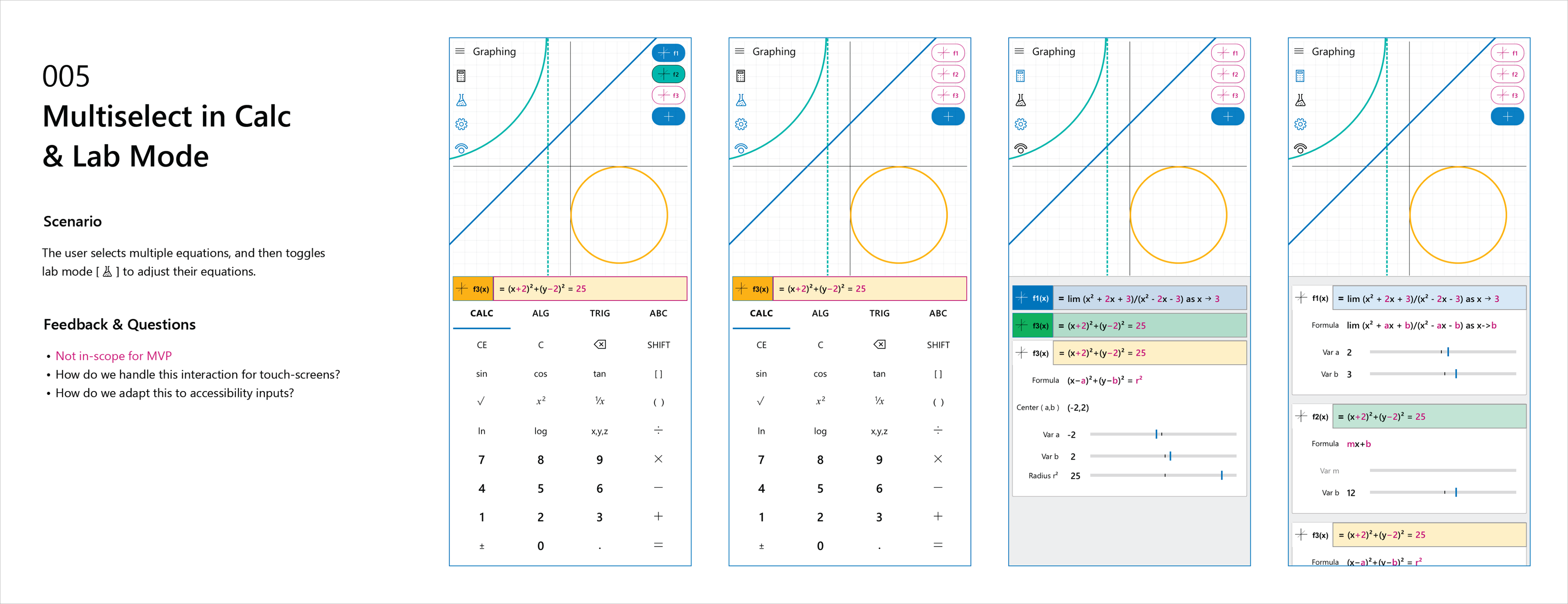
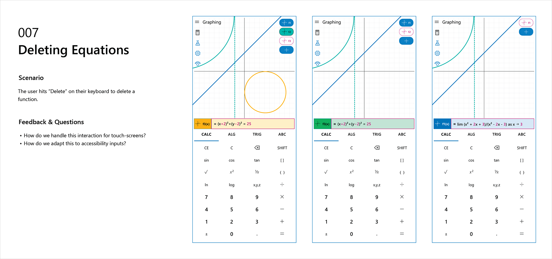
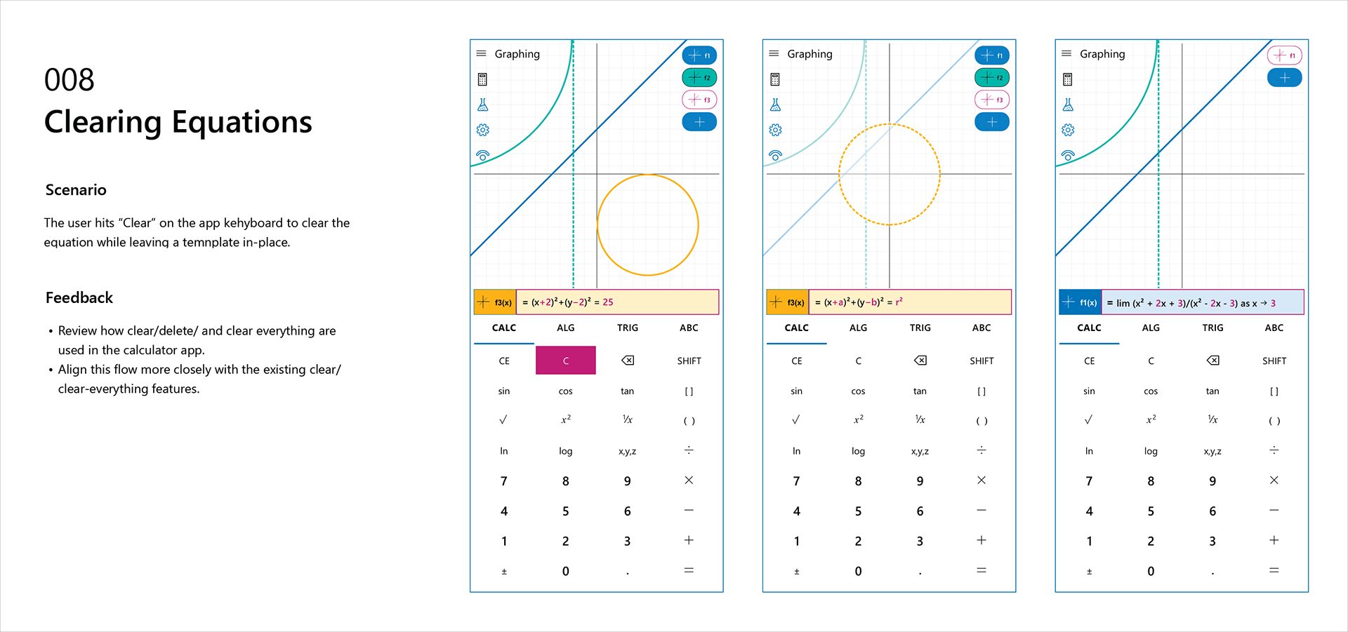
Key user scenarios are stories that ground the User Cans in a specific journey. They are specific enough to illuminate the kind of interactions that will take place. Sometimes the specific element needed is mentioned. Other times it is best to omit the element and focus on the "function."
For instance, there's no UI element besides a graph which can be used in-place of a graph. What elements are needed to enable customization of that graph? This is open for debate, as we have to consider our target audiences, peripheral users, and those with accessibility needs. The Key Scenarios focus on the criteria for success and failure of a given scenario. This gives the designer more ways to consider their user journeys and design explorations.
The Process
After defining our scenarios, scope, and schedule, our next task was to begin laying out the user journeys and exploring the UI/UX that would drive our application. We started with the "mobile version" of our application. We wanted to start exploring solutions with as many constraints as possible.
User Journeys
The user journeys were invaluable to our process. We used them to refine UI, test solutions, and solve disagreements internally. Five to ten versions of a scenario can be laid out in the time it takes to develop a robust prototype. These time savings were critical to meeting deadlines and keeping design in-sync with development.
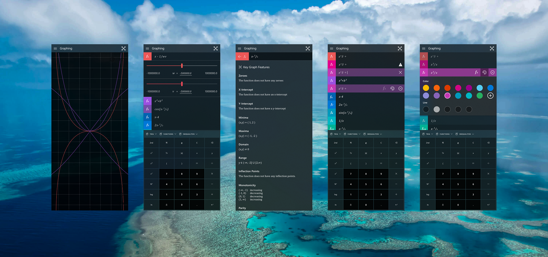
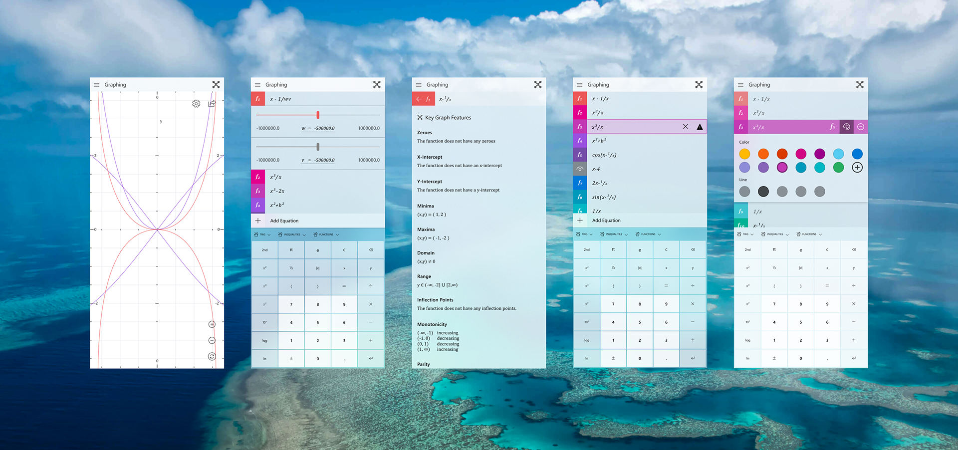
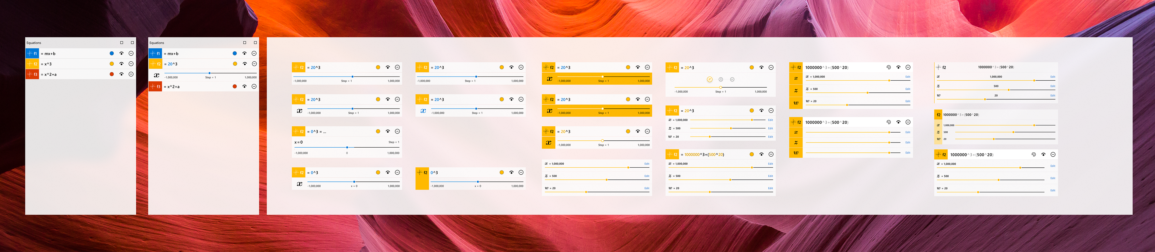
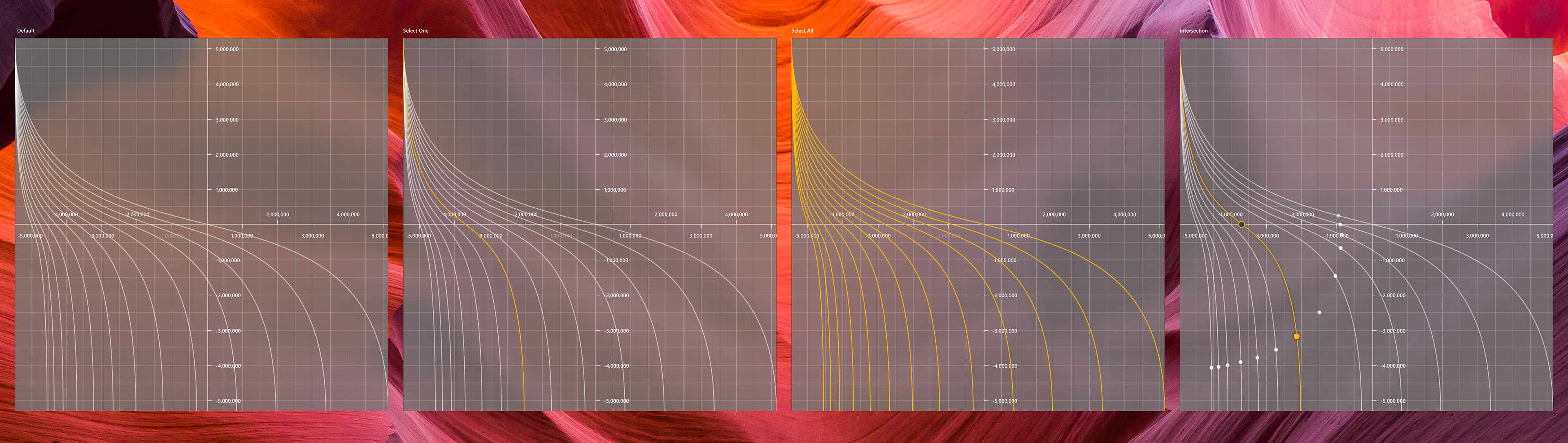
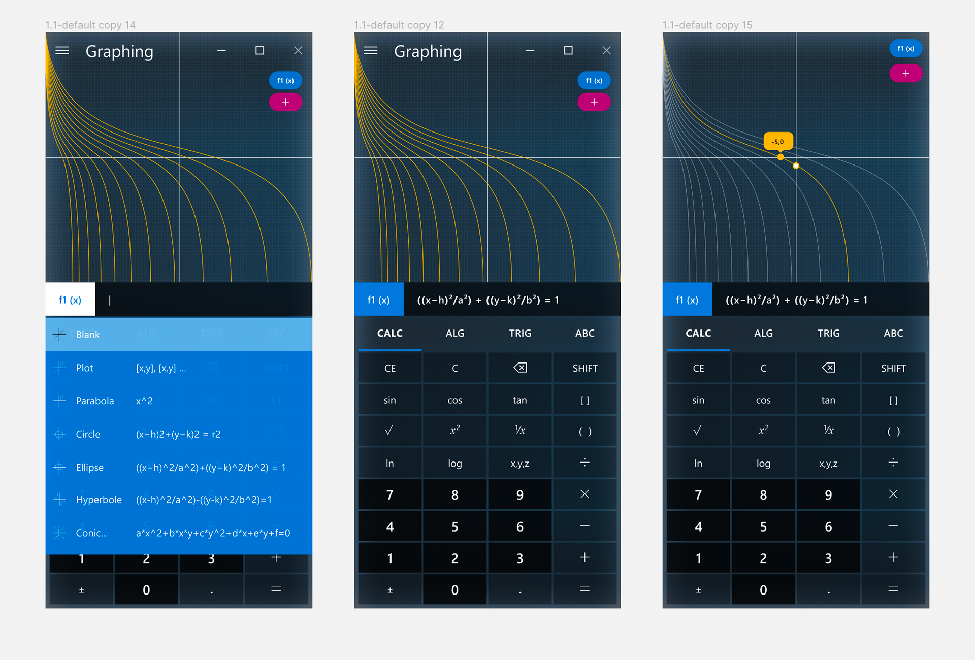
Explorations
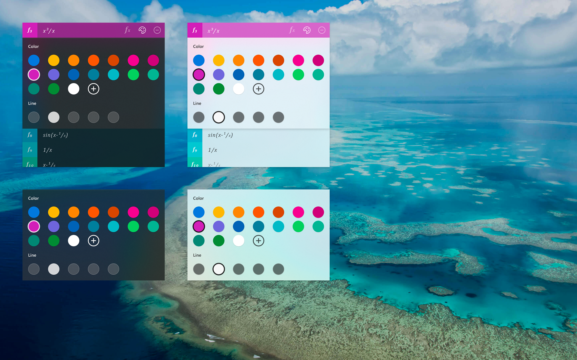
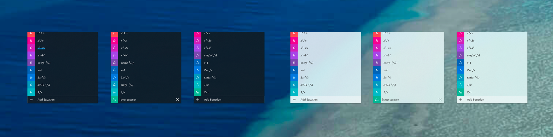
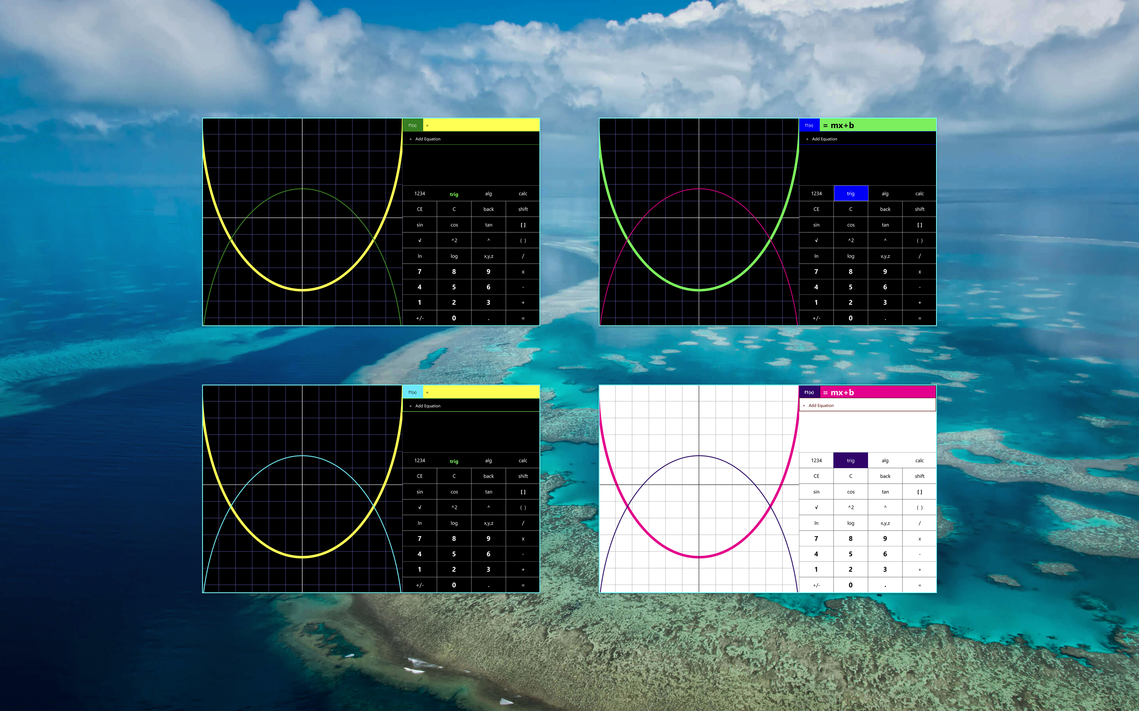
Explorations took place while and after user journeys were established. Explorations included UI, color, scale, interactions, typography, etc. Months were spent exploring the various components until a robust visual language was established.
Lab Mode Explorations - Windows Surface
Lab Mode Explorations - Figma
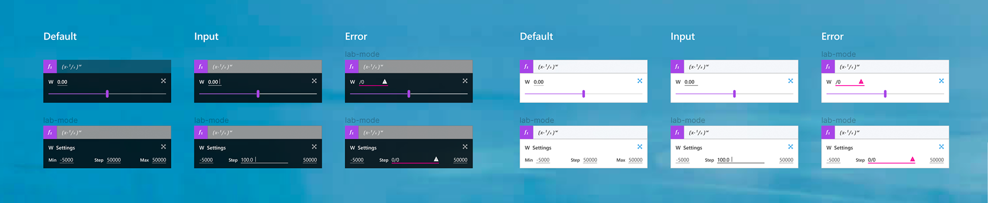
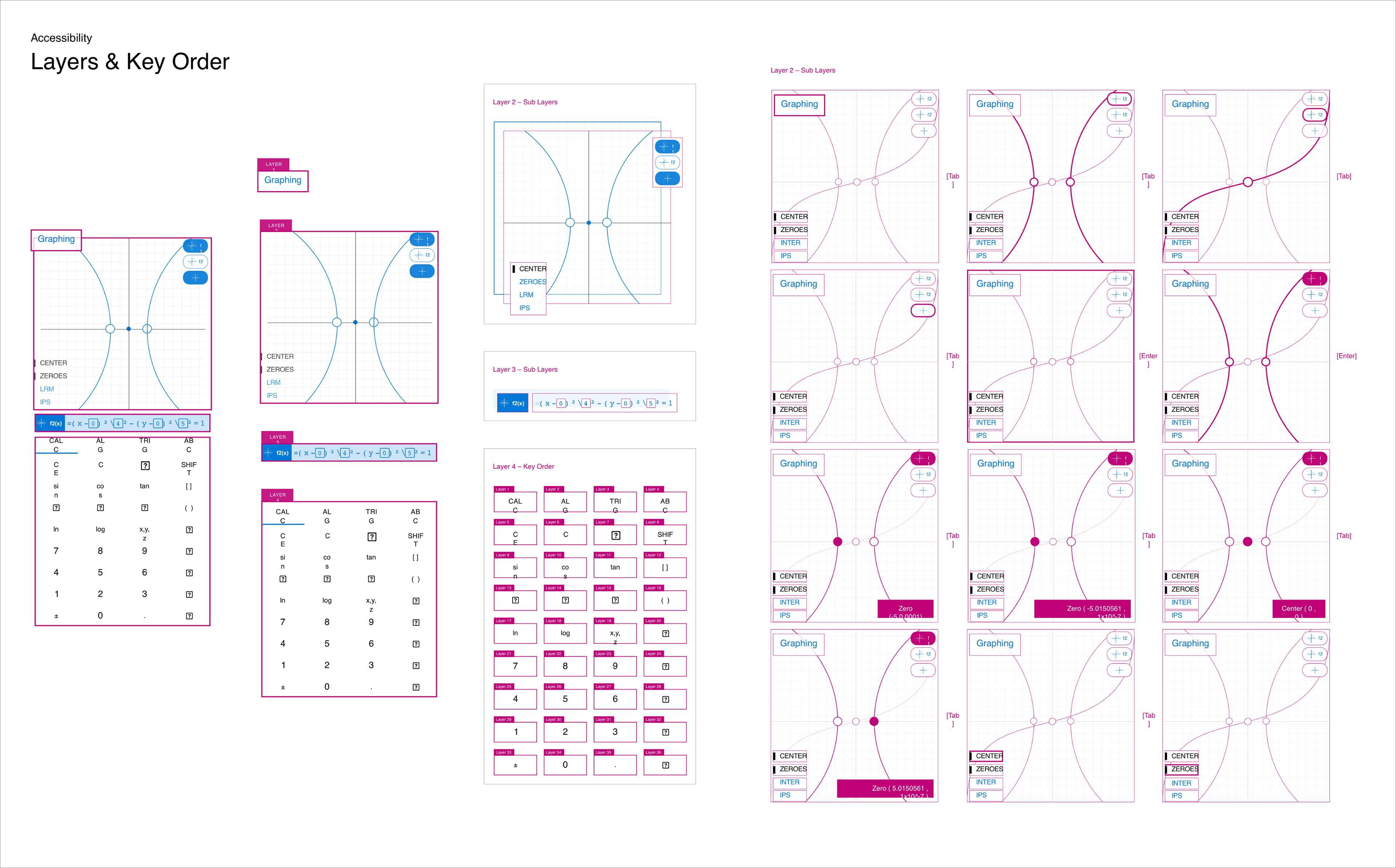
Accessibility
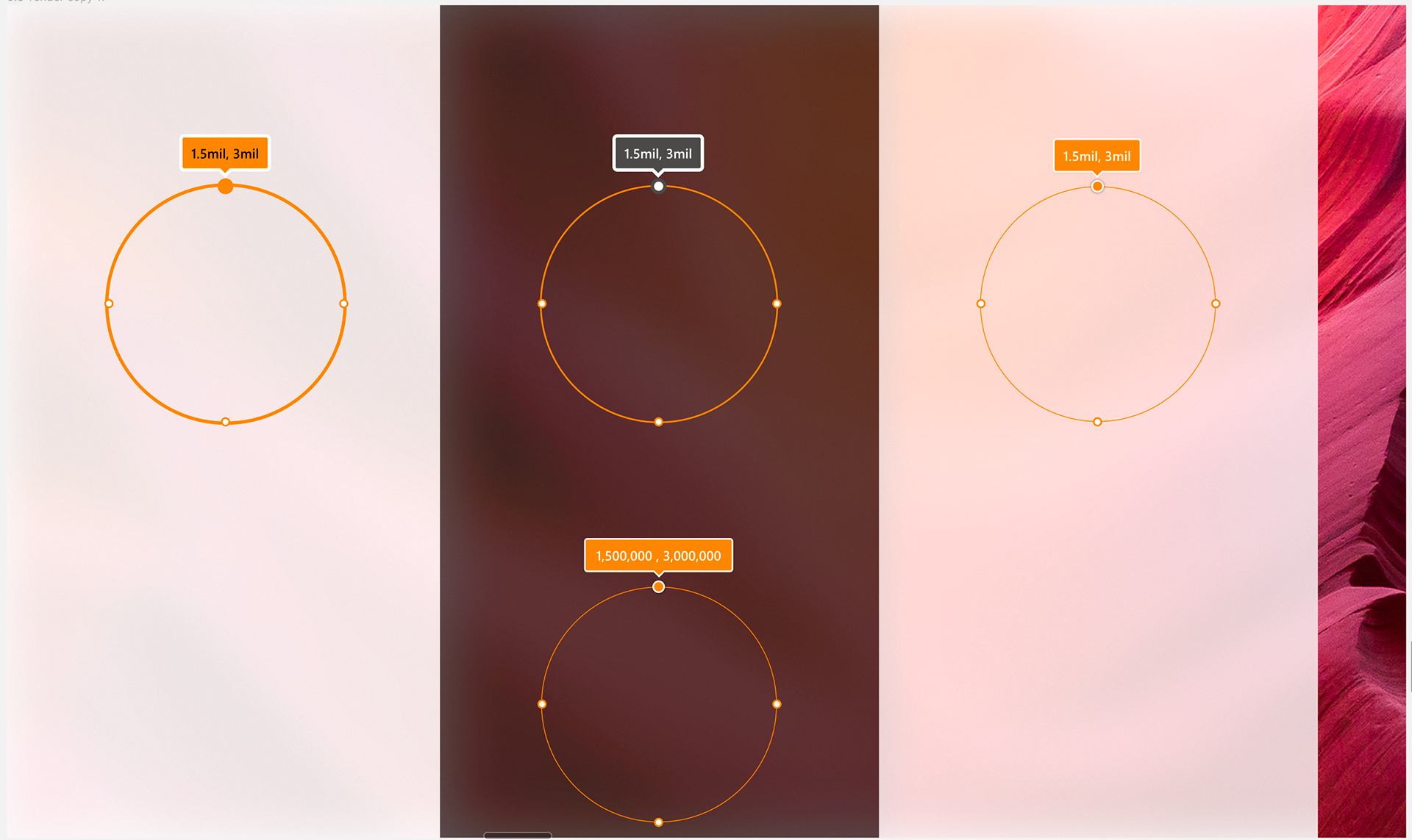
Every interaction that could be performed by keyboard, mouse, or gesture had to be possible via keyboard-only input. I dismissed my ideas if I was unable to find an accessible solution. Accessibility challenged me to think of my UI's organization on a fundamental level. Everything from how a cursor would be activated via keyboard, to the layer order of the keypads was considered.
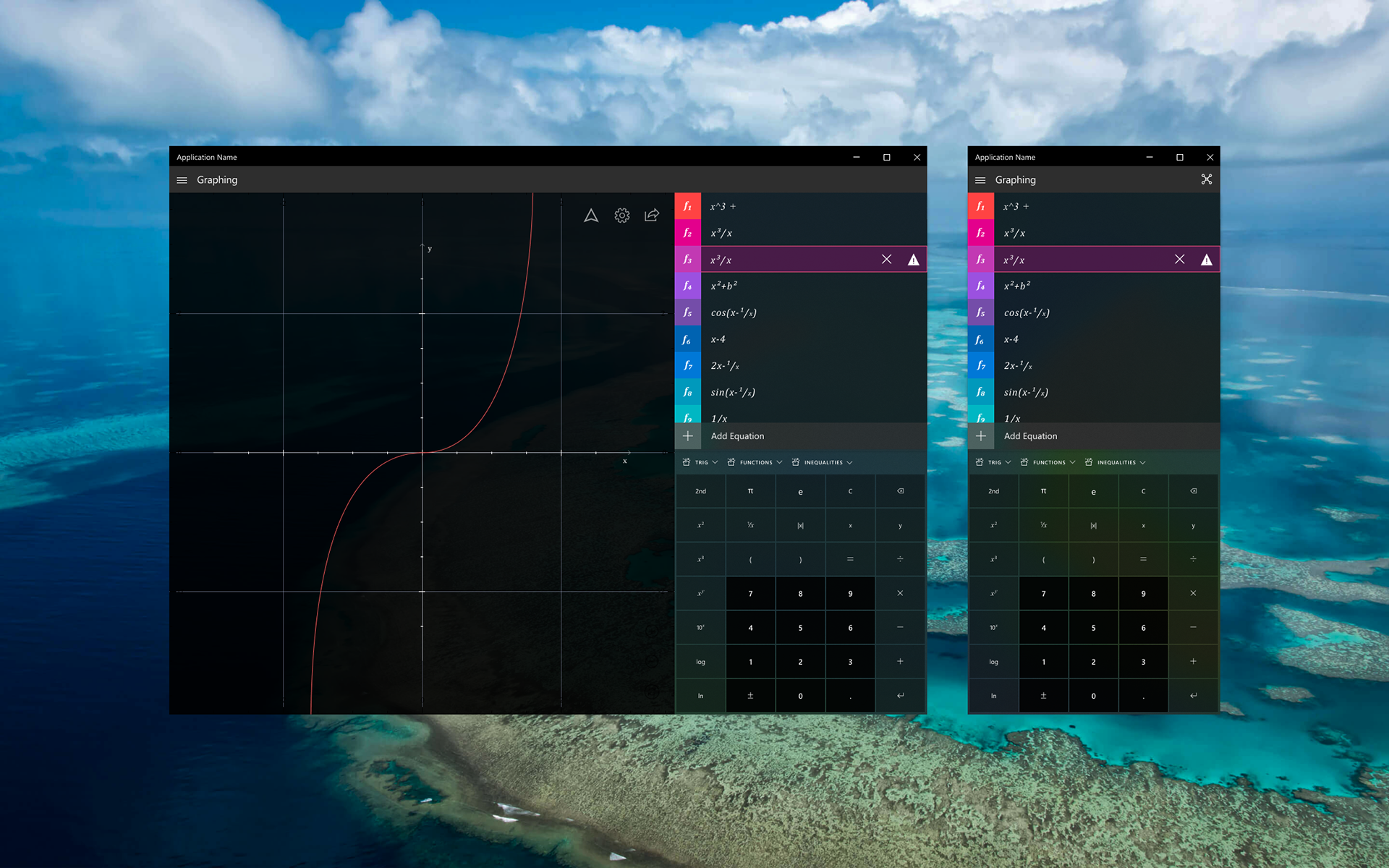
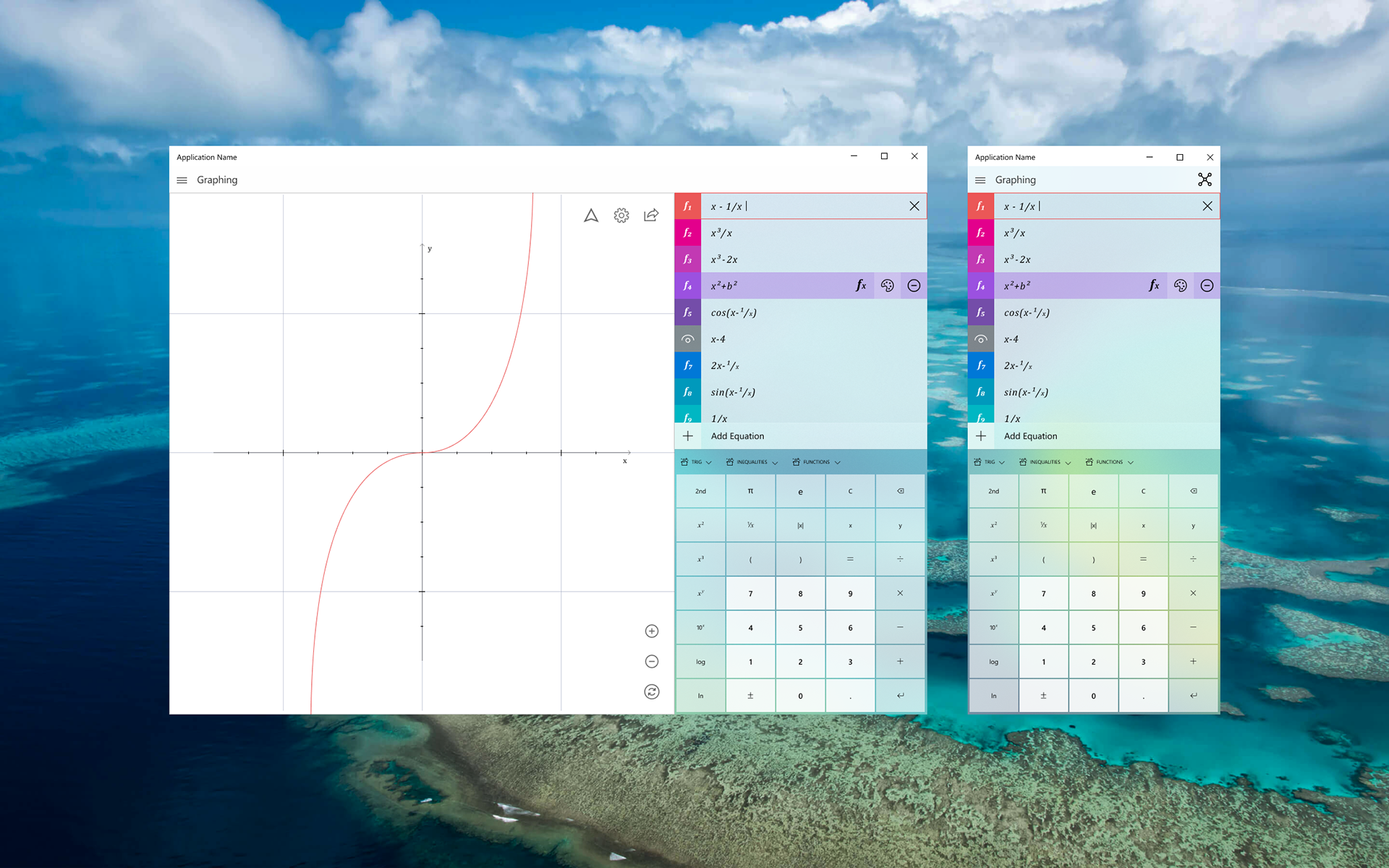
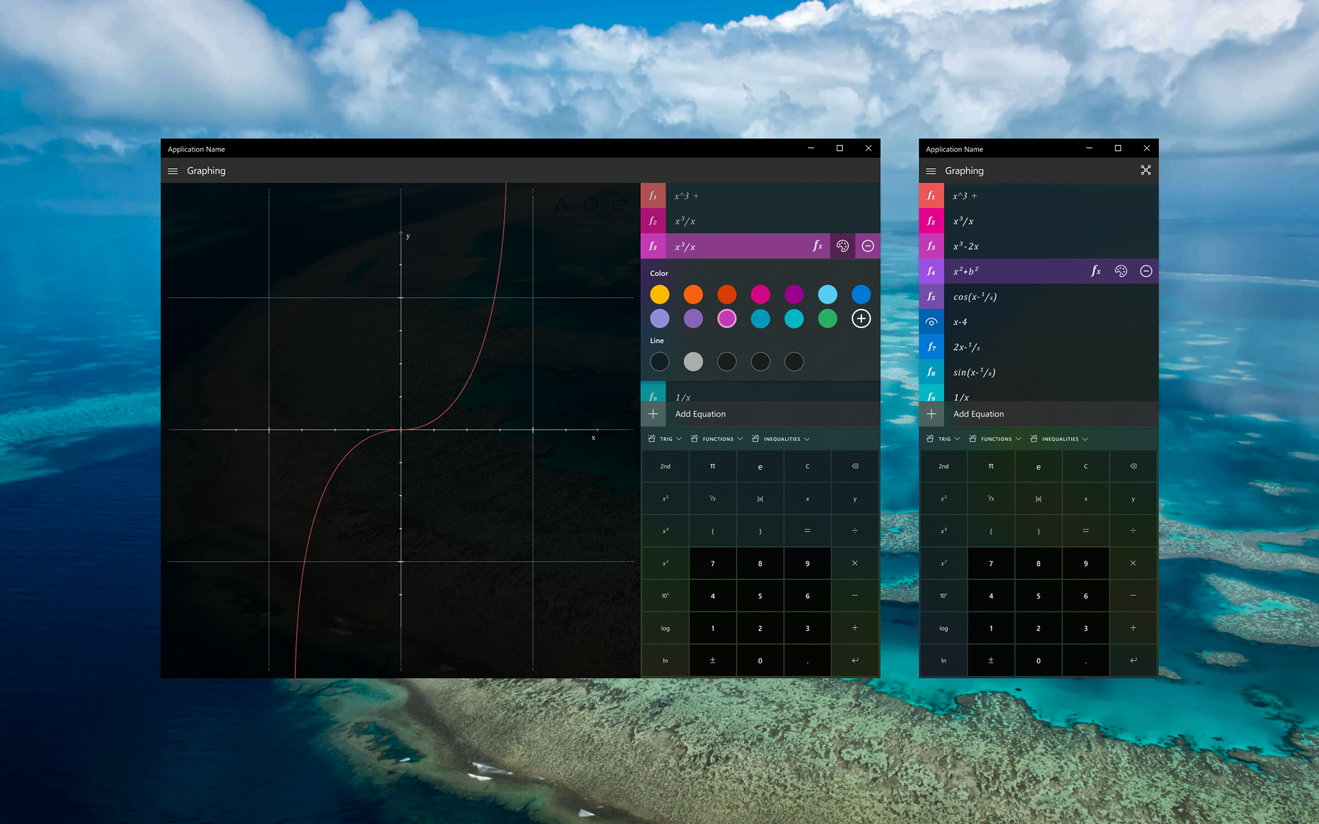
Final Product
The final version of our graphing calculator is a significant improvement upon what previously existed. It allows for users to interact with equations in a way that was never before possible via Microsoft software. The open source solution is available Q3 of 2019.